My secrets for choosing the perfect wedding palette
Choosing your WEDDING COLOURS doesn’t have to be stressful!
Your wedding colour palette is more than a selection of shades - it is the FOUNDATION to your entire DESIGN STORY. When thoughtfully chosen, it allows your florals, decor elements, textures and space to speak IN QUIET LUXURY!
If you are stuck, and everything is starting to feel muddy or mismatched, it’s usually not your tastes, it’s the structure of your colours and how you are using them.
Steal my proven method of choosing the perfect colour palettes.
Every palette needs a backbone
Before adding accents, choose one dominant neutral or tone. This will give your palette a foundation to lean on. Every other detail will feel settled and intentional.

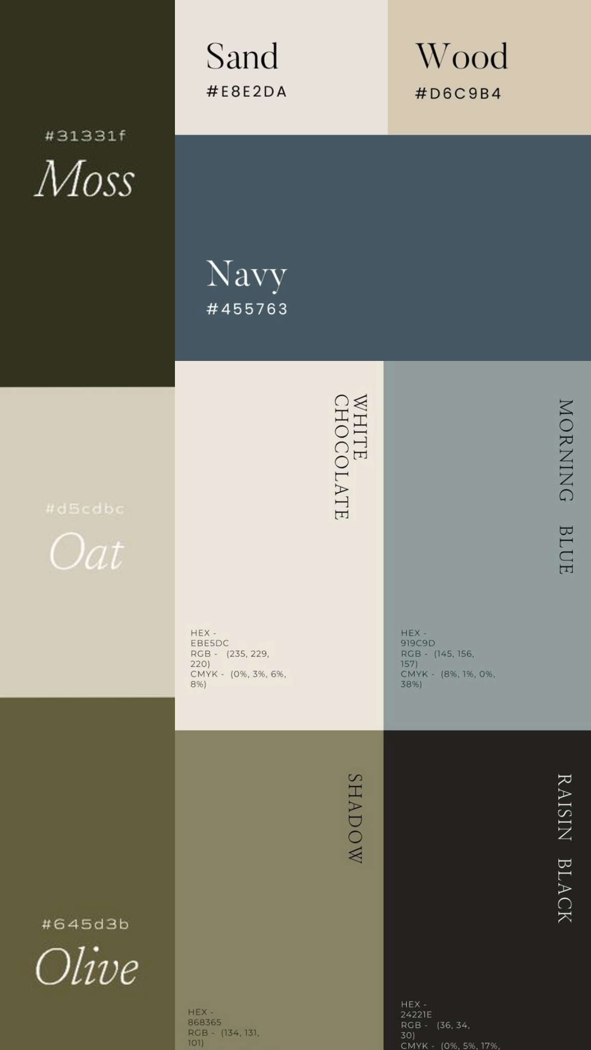
BUILD A BALANCED PALETTE
Aim for 5 tones
2 NEUTRALS + 2 SUPPORTING SHADES + 1 ACCENT
This structure allows for florals and elements to feel layered, not overwhelming.
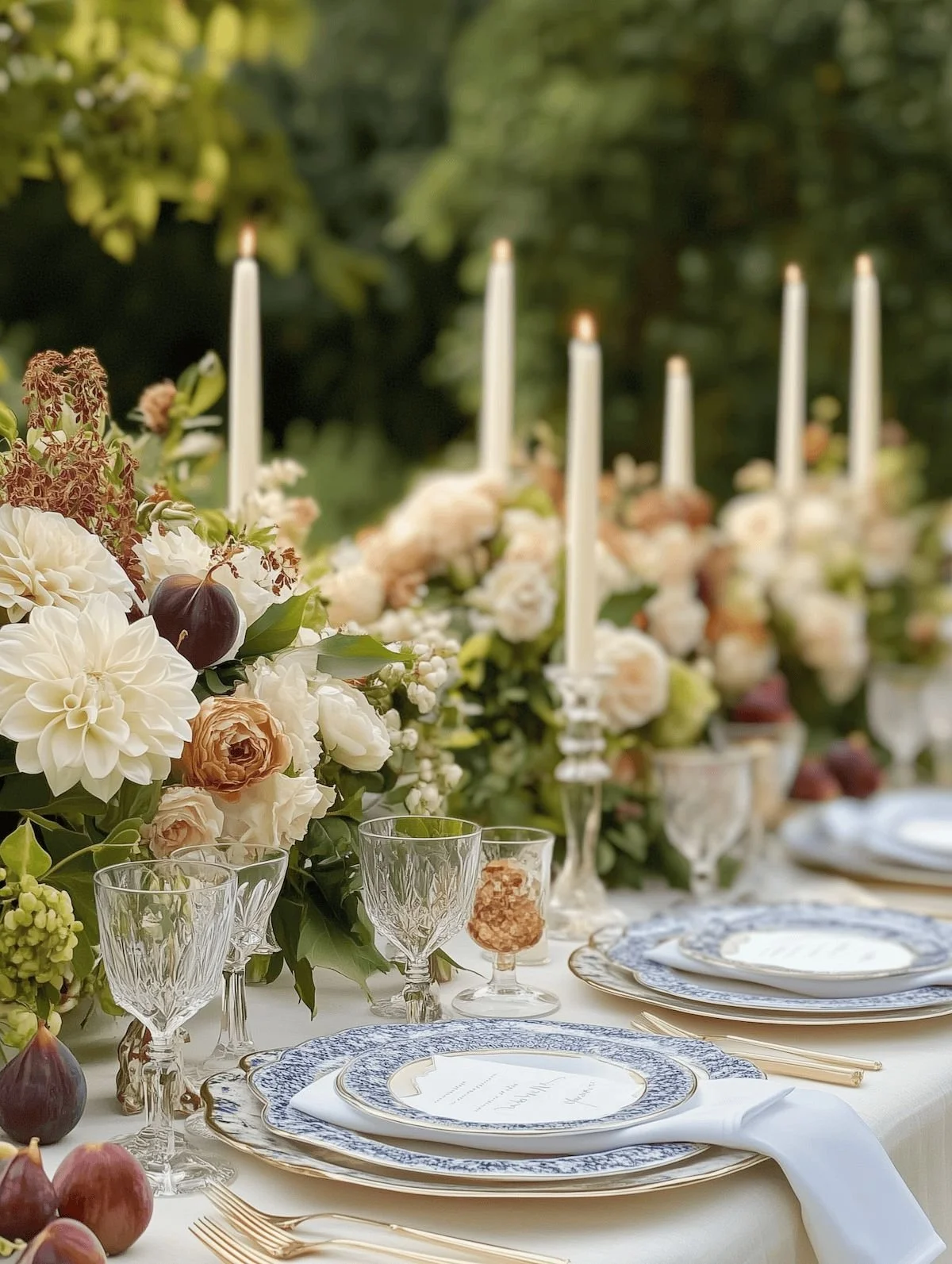
Accents aren’t meant to appear everywhere!
Florals, linen, stationery, signage, attire - repetition CREATES HARMONY, overload creates competition. Allow your colours to BREATH where they matter most.


LET THE VENUE LEAD
Your venue is a part of the palette - Floors, walls, Furniture and lighting all influence how colours appear. A palette that works on-line may fell off in your space if these features are overlooked.
As a designer, I always begin with the space. Architecture, light, surroundings set the tone. Your palette should feel intentional within your event space.
The goal is to create harmony, not competition!
Contrast creates clarity
Light vs dark, soft vs structure, textures vs flat, intentional contrasts makes your palette feel thoughtful, not accidental.
Design with the season
Nature never rushes - neither should your palette! Spring invites SOFTNESS and MOVEMENT. SUMMER allows for WARMTH AND DEPTH, Autumn EMBRACES richness and textures. While WINTER calls for restraint and contrast. Seasonality brings effortless sophistication.

Less choice means better decisions
Timeless weddings don’’t overwhelm with colour - they focus on beautifully curated and thoughtfully placed elements.
Define the feeling, not just the colours
How do you want the day to feel? Before you begin selecting hues, shades and tones, ask yourself: INTIMATE …. REFINED …. WARM …. MOODY … TIMELESS? Once you define the emotion, the aesthetics follow effortlessly. Emotion informs colours more than trends ever will.
A designers final thought
The most beautiful palettes feel effortless - as they they were always meant to exist together. If you have been second guessing your choices, it’s not your tastes! It’s the structure of your palette and how you’ve used it. With a little guidance, your palette can feel effortless, harmonious and unforgettable!
Designing something beautiful begins with a conversation
If our approach resonates with you, we would love to create something truly bespoke for your celebration. We offer complimentary floral + design consultations to explore your vision, palette and design direction. Reserve your complimentary wedding floral + design consultation via the link here.